Static HTML reports
Analyze your reports thanks to the indicators, active users and requests / responses over time, and distribution
Overview
Global menu points to consolidated statistics.
Details menu points to per-request-type statistics.
You can use the -ro option to generate reports from a truncated simulation.log file, for example when the run was interrupted (Ctrl+C or process killed).
Note that the component in charge of logging into the simulation.log file uses a buffer, so last data might be missing if you forcefully interrupt. See Configuration page.
Overall Simulation charts
Most of those charts are available for both the overall simulation report and for per request/group charts.
Response time ranges
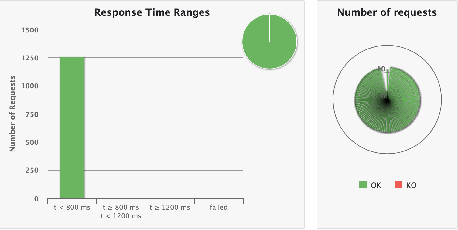
This chart shows how response times are distributed among standard ranges. The right panel show number of OK/KO requests.
gatling.conf file.Summary
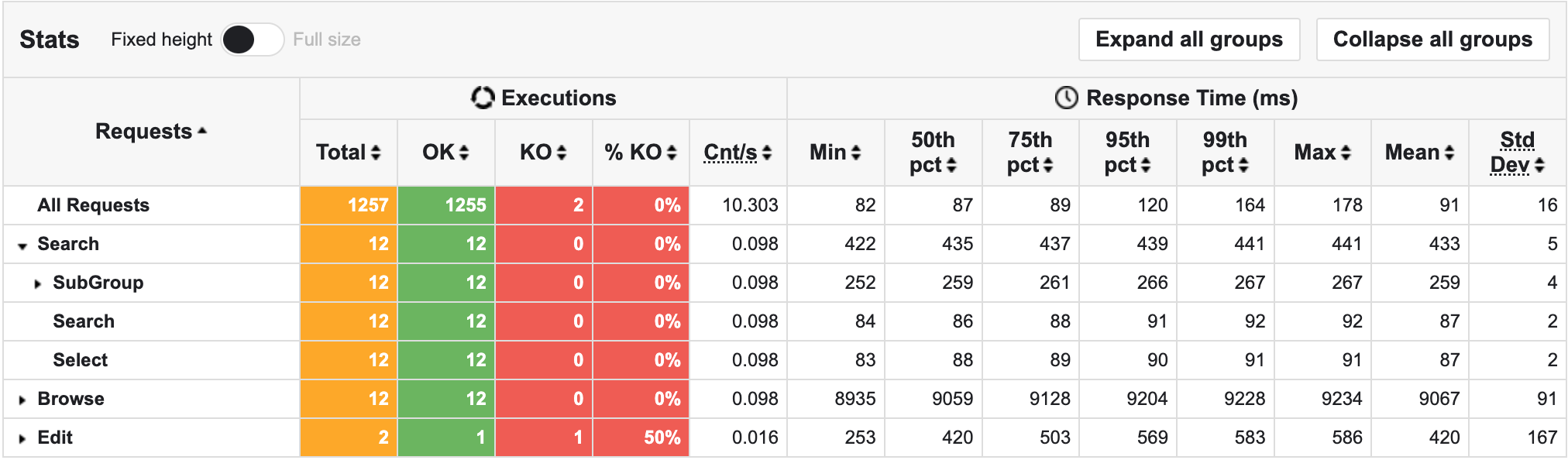
The top panel shows some standard statistics such as min, max, average, standard deviation and percentiles globally and per request.
gatling.conf file.gatling.conf file.The bottom panel shows some details on the failed requests.
Users start rate
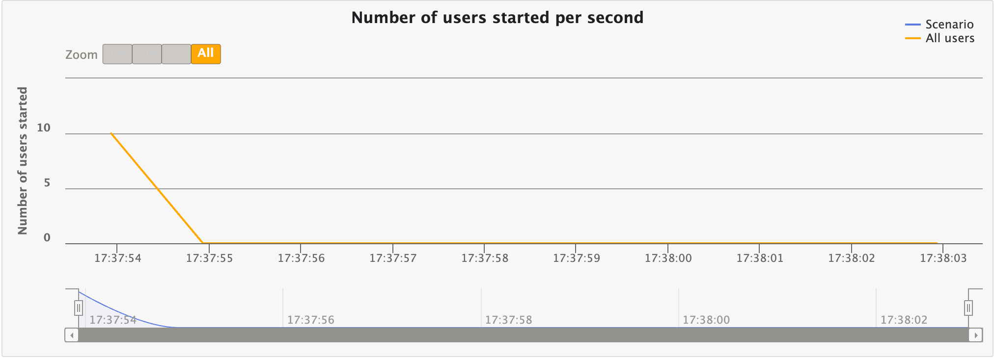
This chart displays the number of users started per second over time. This would match your injection profile if you’re using an open one.
Number of concurrent users
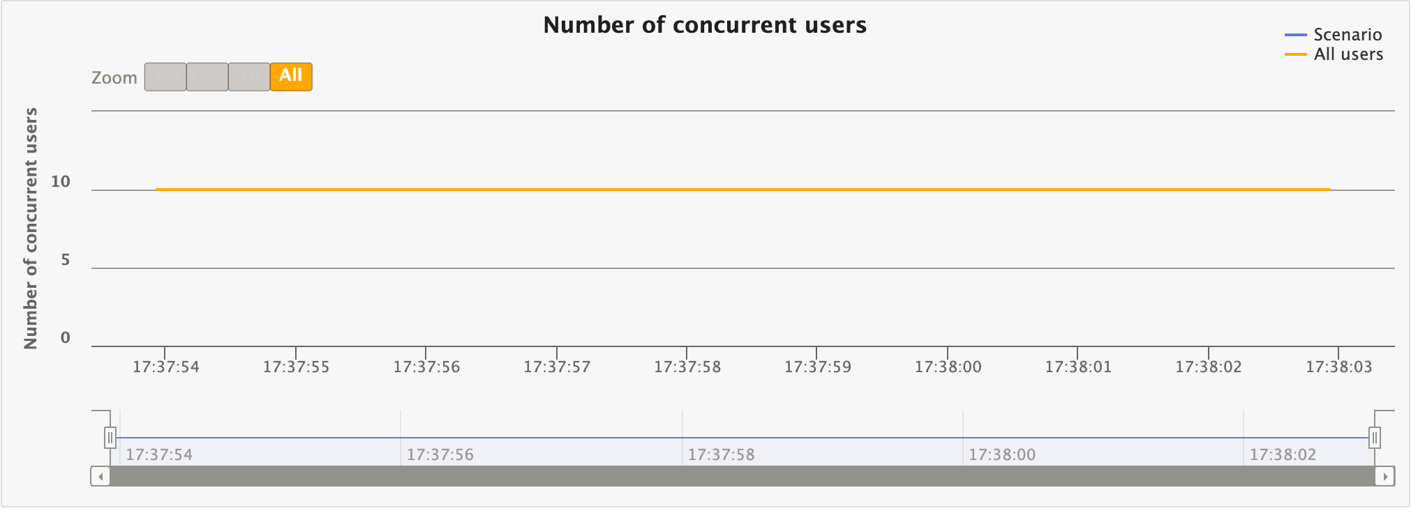
This chart displays the number of concurrent users over time. This would match your injection profile if you’re using a closed one.
Response time distribution
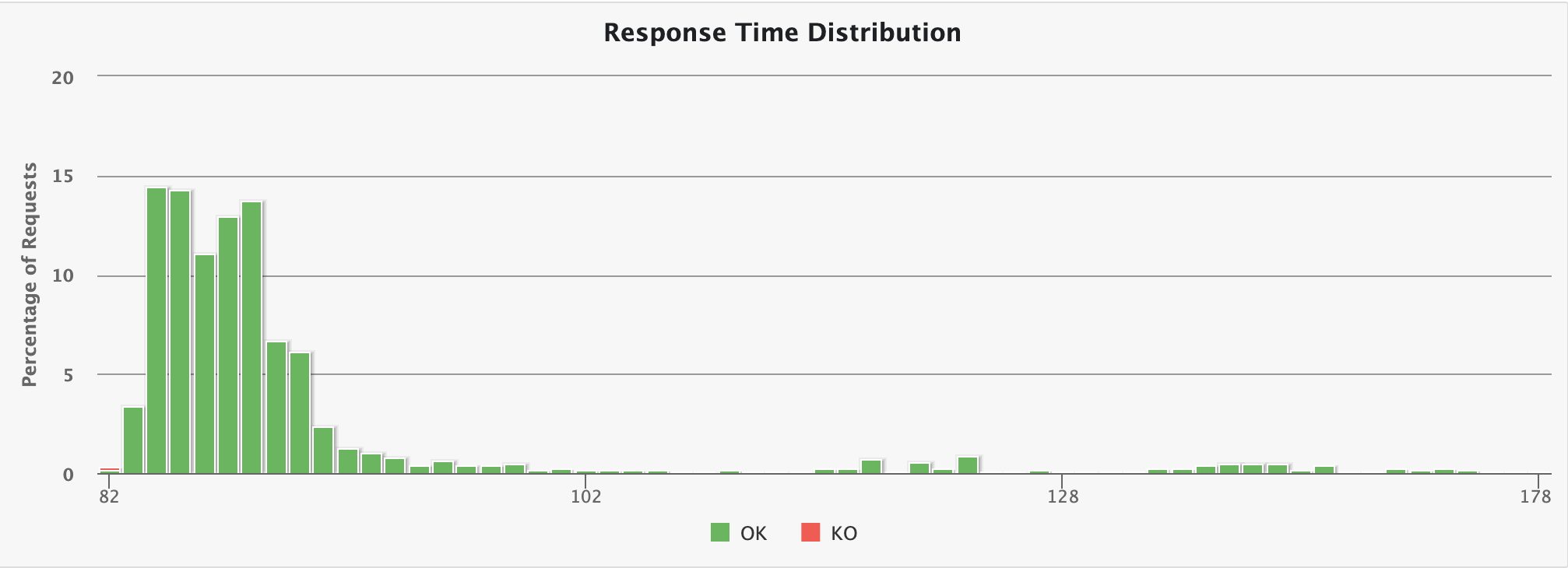
This chart displays the distribution of the response times.
Response time percentiles over time
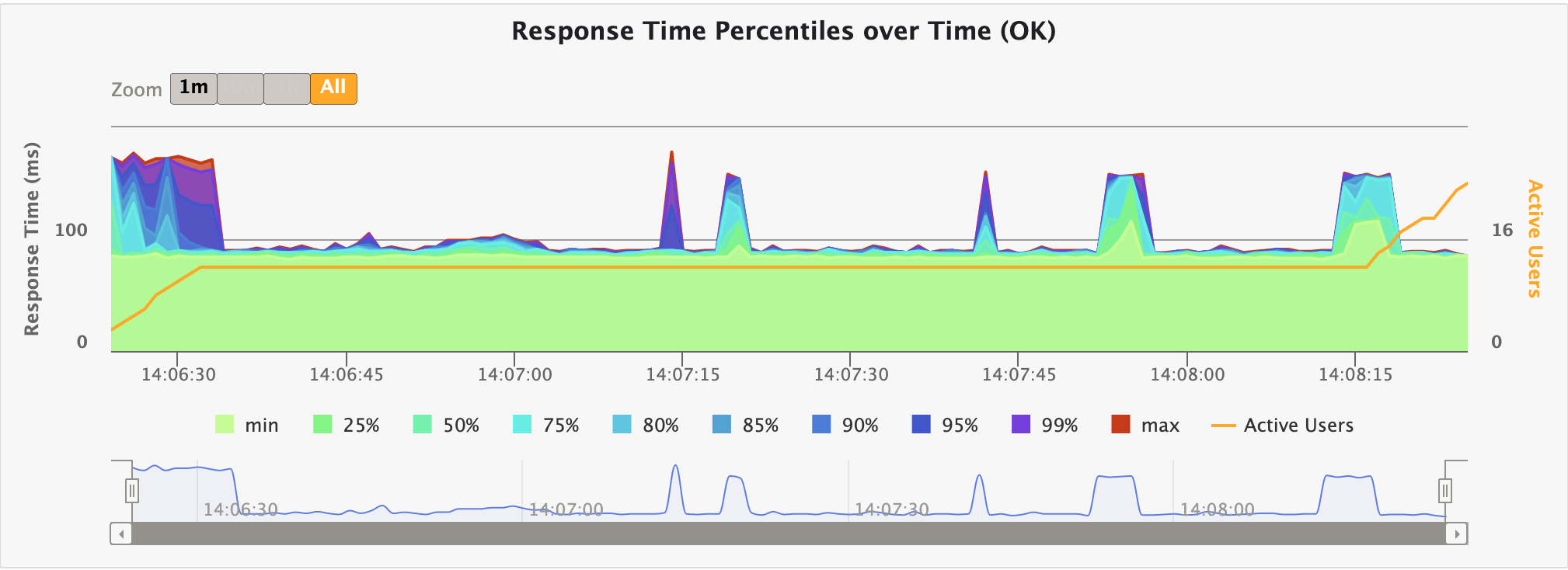
This chart displays a variety of response time percentiles over time, but only for successful requests. As failed requests can end prematurely or be caused by timeouts, they would have a drastic effect on the percentiles’ computation.
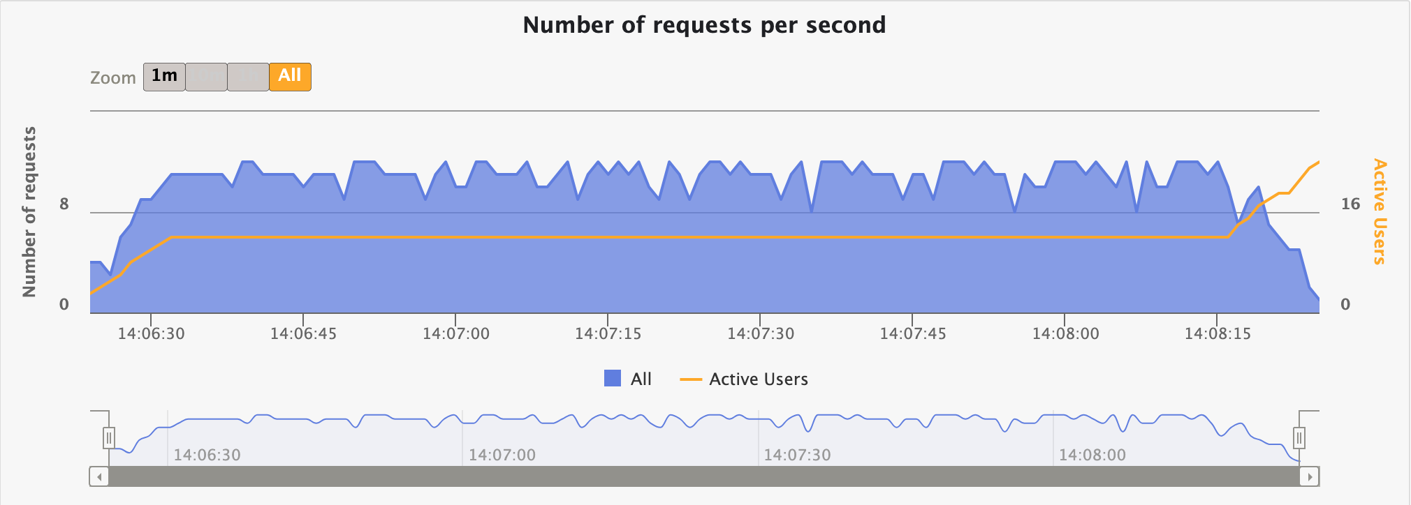
Requests per second over time
This chart displays the number of requests sent per second over time.
Responses per second over time

This chart displays the number of responses received per second over time: total, successes and failures.
Request/group specific charts
Those charts are only available when consulting the details for a request/group.
Response Time against Global RPS
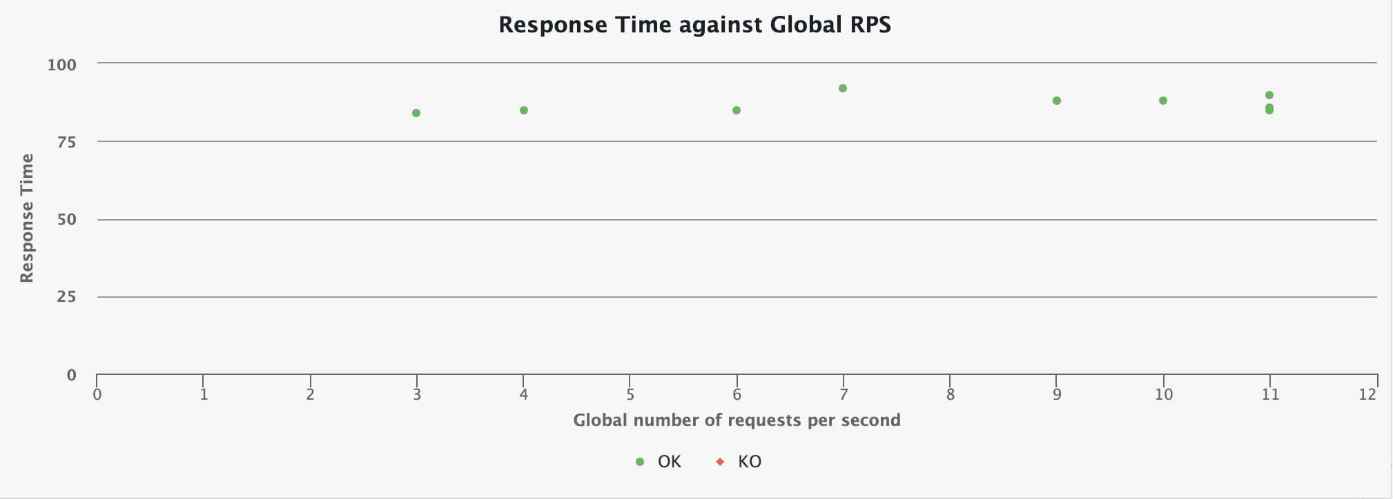
This chart shows how the response time for the given request is distributed, depending on the overall number of request at the same time.