Interactive reports
Analyze your reports and discover the bottlenecks in your application.
Click on the icon in the tests table or in the runs table to access the reports.
This view displays all the metrics available for a specific run.
The page is split into a header displaying the run title with the general actions, and the three main following sections:
Summary
The main objective of this tab is to provide a brief overview of your run performance.
The first section gives you general information about your run configuration and execution:
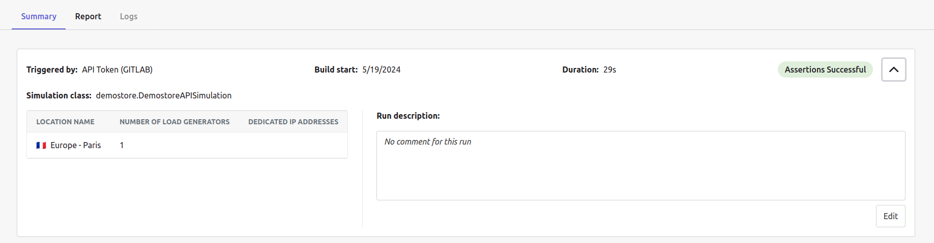
You can add a description to your run by clicking the Edit button and then Save.
Main KPIs
This section displays your run main KPIs:

- Error ratio: the ratio of responses with errors compared with the total number, in percent
- Total requests: the total number of requests made during the run
- Max. concurrent V.U: the maximum number of concurrent virtual users during the run
- P95 response time: the response time of one of the requests, such that 95% of the requests were faster and only 5% were slower
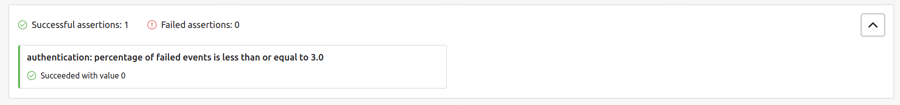
Assertions
Assertions are the run’s acceptance criteria. It allows you to quickly know if your requirements are met or not.
Assertions are created in the test script using the Gatling SDK or in the no-code test builder.
Each assertion has a status (successful or failed) that indicates whether the current run met your pre-defined requirements.
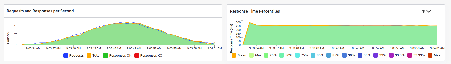
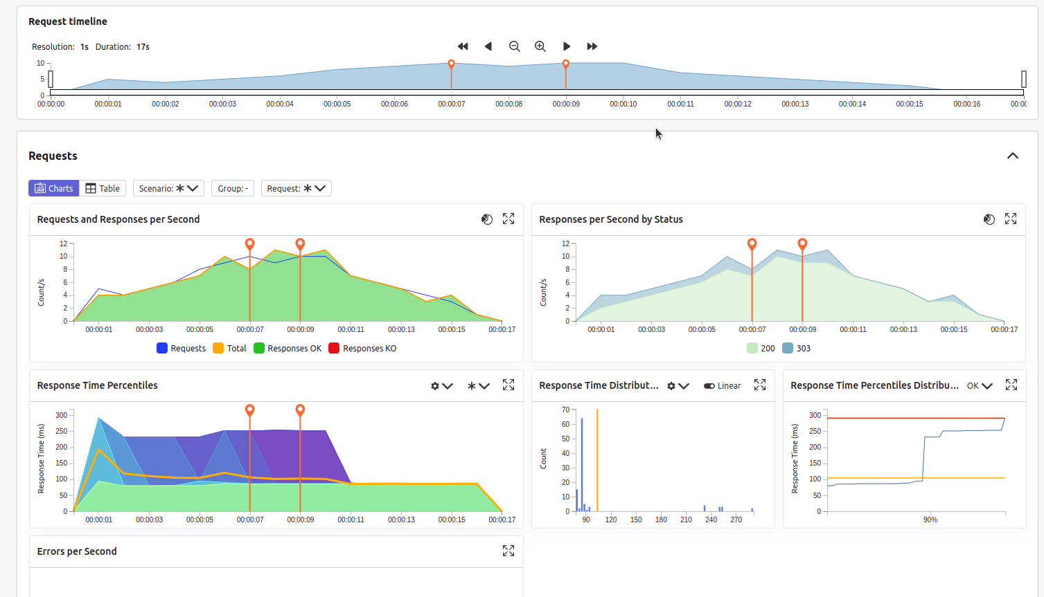
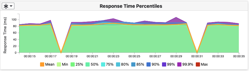
Request and response charts
The following section contains a global overview of your requests and responses per second and the response time percentiles:
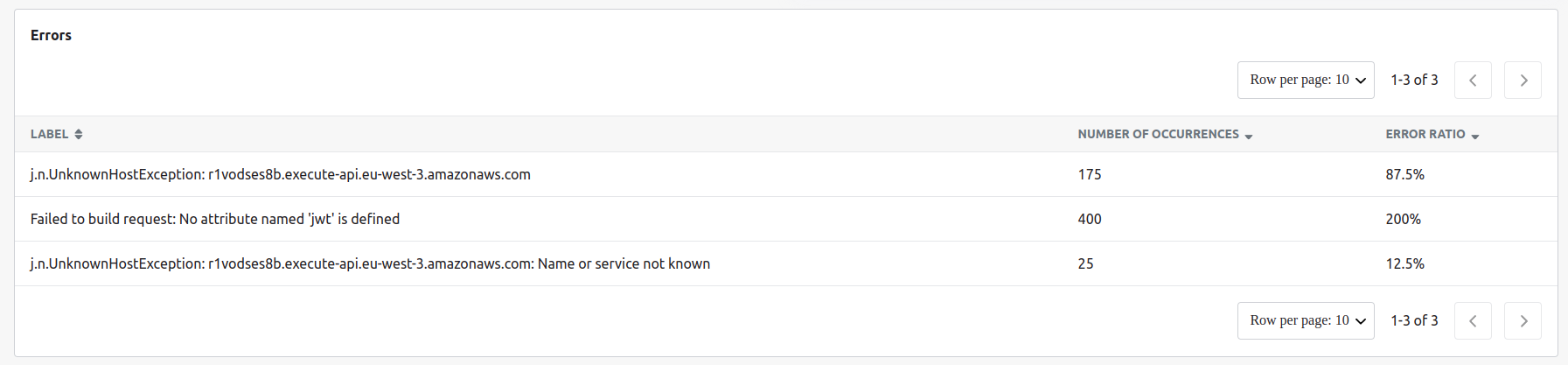
Errors list
The final section contains the details of every error that occurred during your run:
Report
Gatling Reports gives you all the information you need regarding the run execution: details about the injection profile, results including advanced metrics in various charts and formats to allow deep analysis, and the possibility of exporting the raw data for custom reporting.
All metrics and charts are split into the following panels:
- Requests
- Groups (if you defined some)
- Virtual users
- Connections
- DNS
- Load Generators
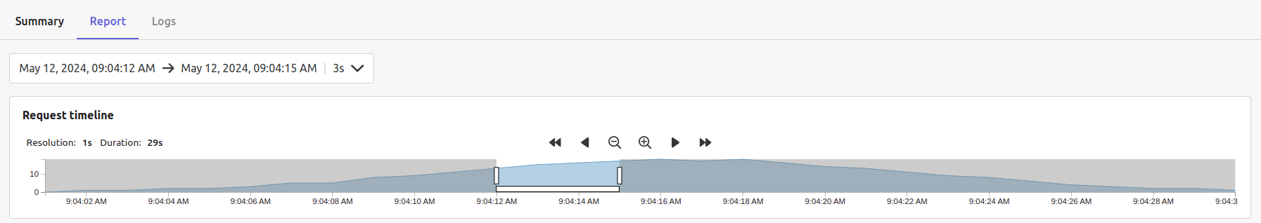
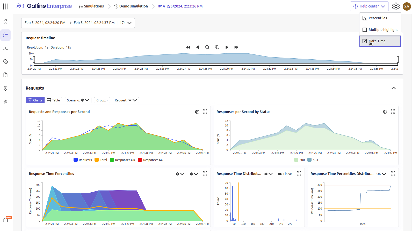
Using the request timeline at the top of the page, you can select your run time range to review by:
- selecting a predefined time range from the dropdown menu or,
- dragging and dropping the desired area on the chart.
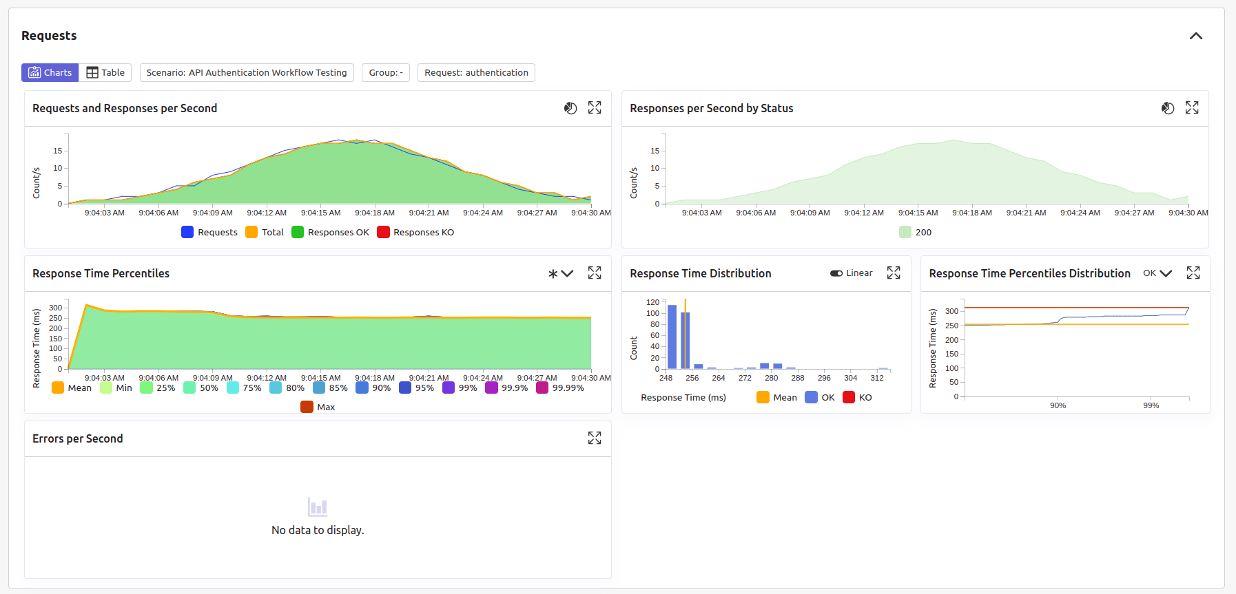
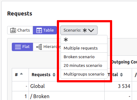
Requests
The requests panel allows you to review how your requests and responses performed over time. You can add scenarios, groups, and requests filtering options to filter by your chosen criteria.
You can visualize your run execution using charts:
or using tabular data:
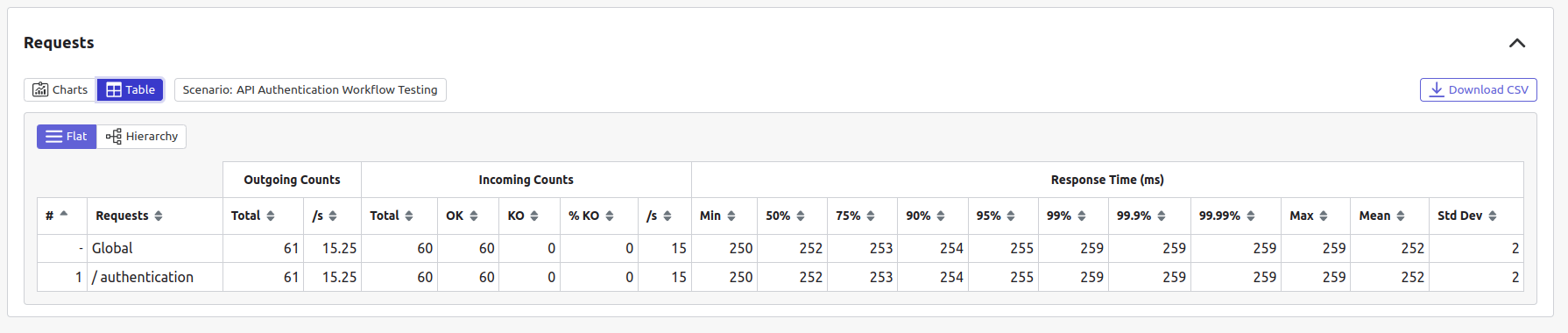
You can download the table as a CSV file for later use by clicking the download button on the top right side of the table.
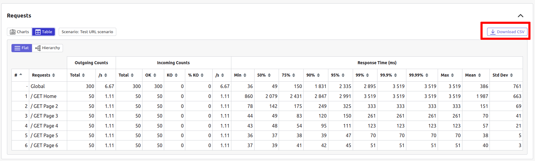
CSV files are generated according to the selected Scenario
When downloading a group-level summary, you receive data for both Duration and Cumulated response time.
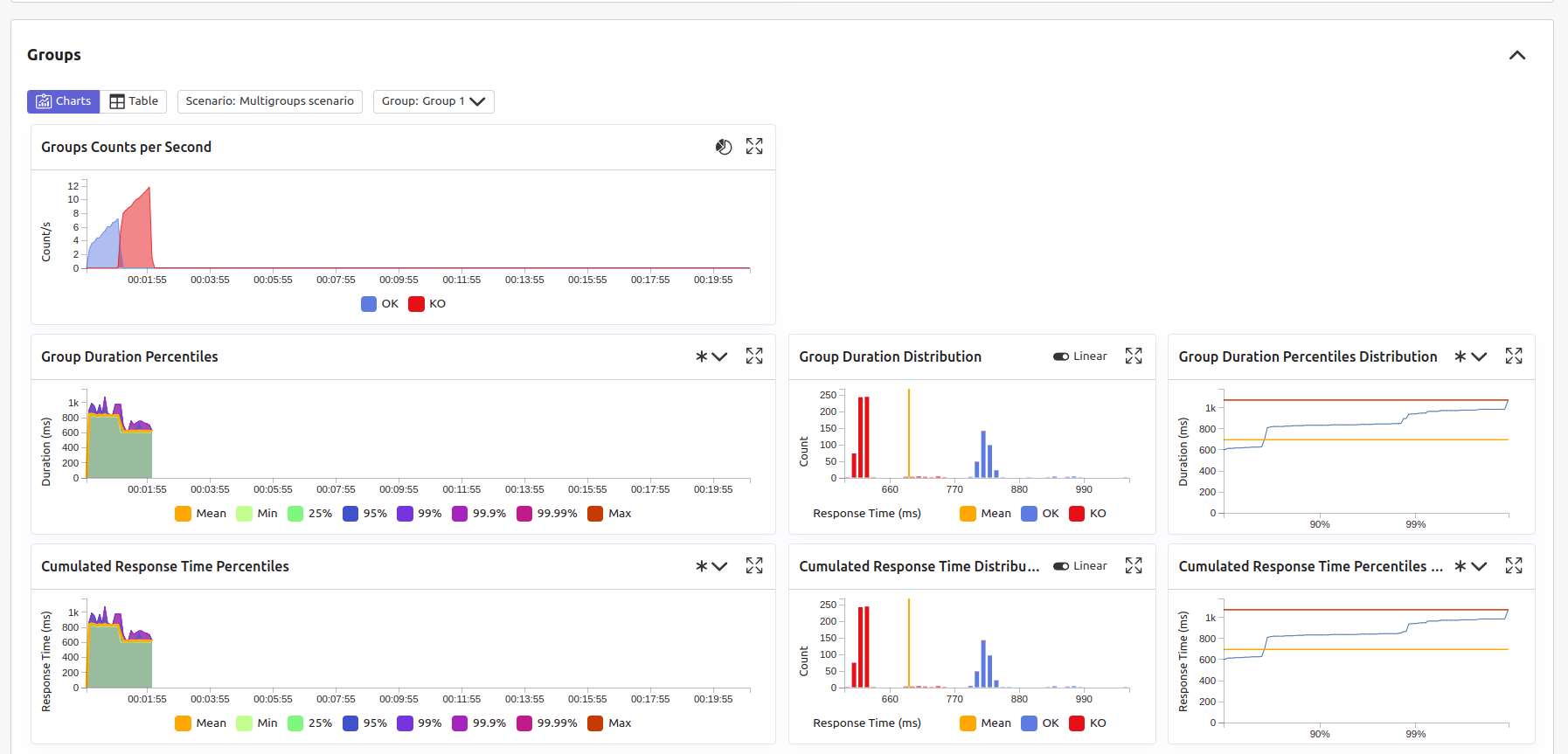
Groups
If you defined groups in your simulation, you can break down your results per each one of them.
Once again like the requests panel, you can visualize your run execution using charts:
or using tabular data:
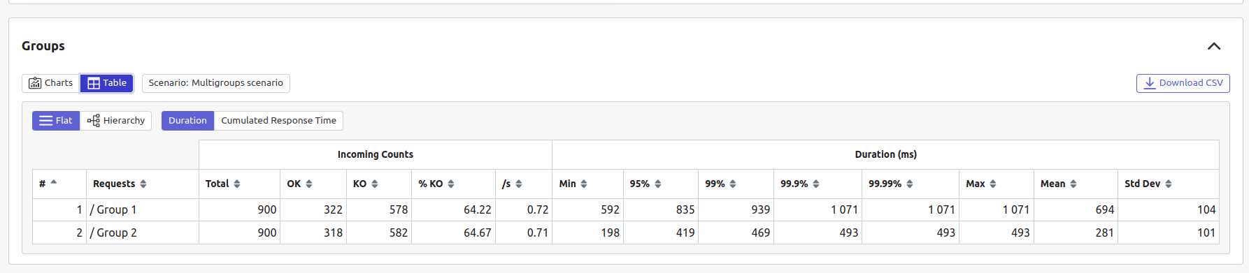
You can download the table as a CSV file for later use by clicking the download button on the top right side of the table.
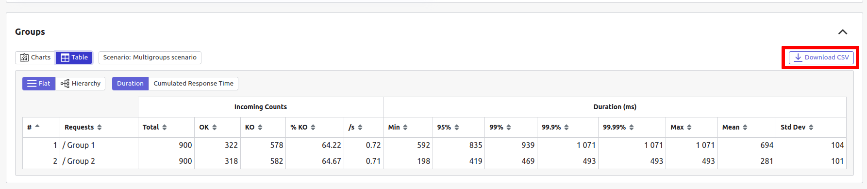
CSV files are generated according to the selected Scenario

When downloading a group-level summary, you receive data for both Duration and Cumulated response time.
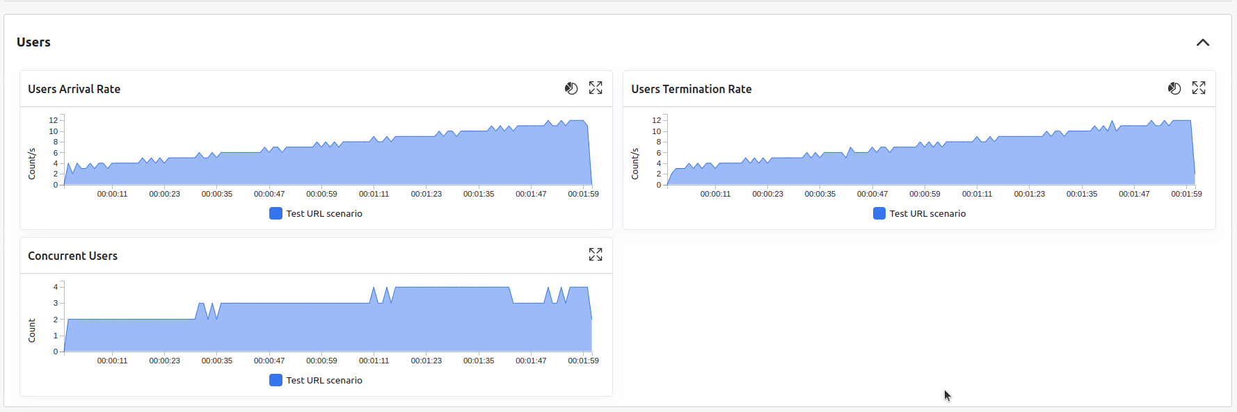
Virtual users
The virtual users panel shows how virtual users defined in your injection profile were injected over time in your simulation.
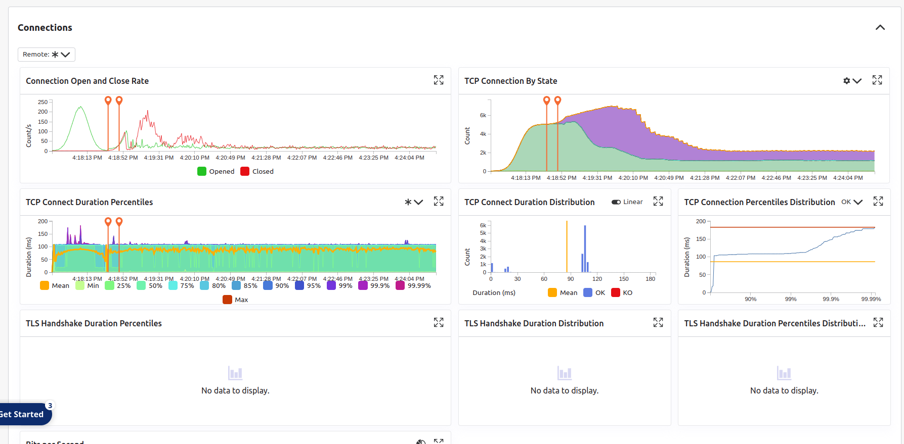
Connections
The connections panel shows the following time-dependent metrics:
- socket connections,
- TCP events,
- TLS handshakes,
- bandwidth usage.
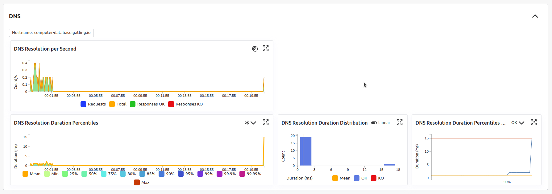
DNS
The DNS panel shows metrics related to DNS requests made during the run execution.
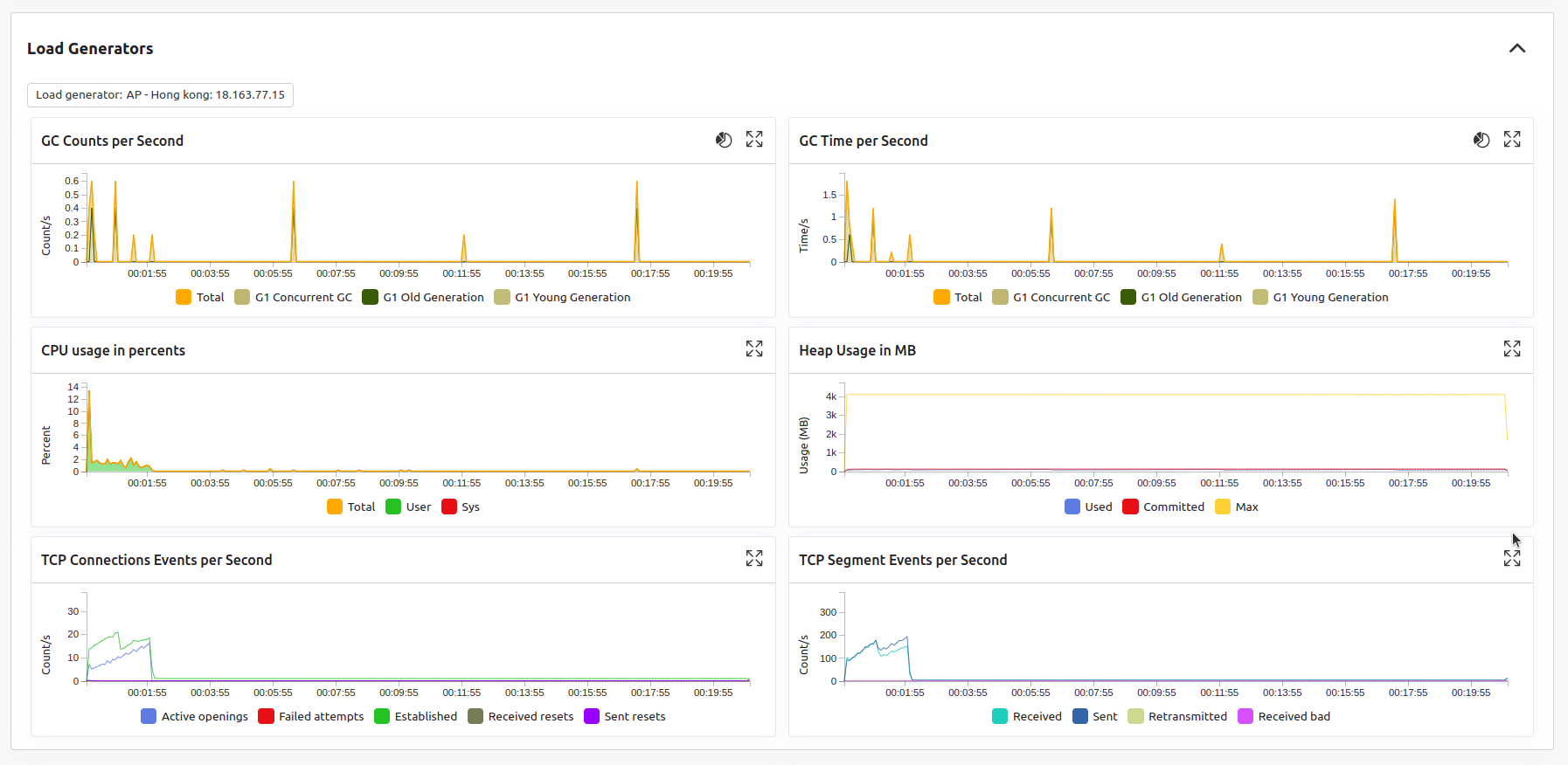
Load generators
The load generators panel shows the following metrics related to the load generators:
- CPU
- heap
- GC
- TCP events
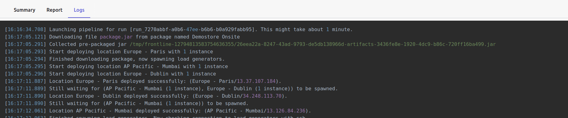
Logs
This tab allows you to read logs from your test and load generators.
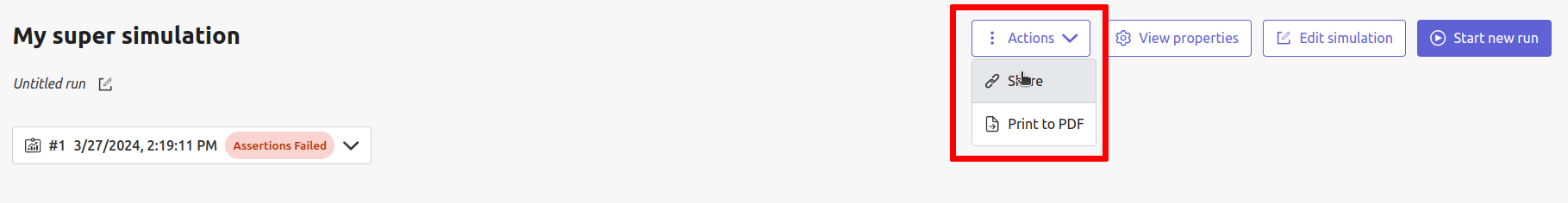
Header
The page header lets you edit your run title by clicking the icon and gives you access to general actions:
Generate shareable links
A shareable link allows access to the current report without needing to log in to Gatling Enterprise. To generate a shareable link, click on the Share button in the Actions dropdown at the top right of your page and choose a link expiration date.
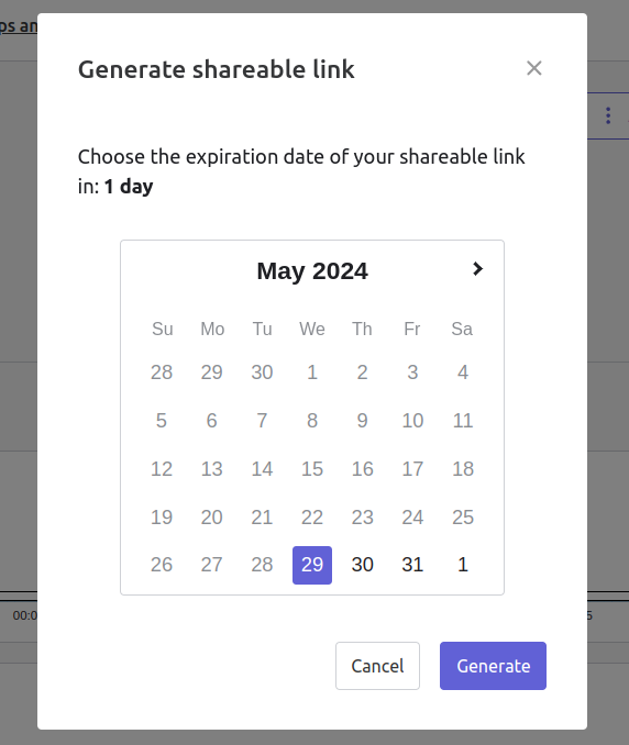
Choose an expiration date, then click the generate button.
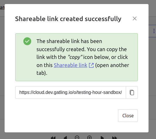
You can copy the shareable link to share your report to non-Gatling Enterprise users, or click on the Shareable link itself to access it. Click on the OK button to close this modal.
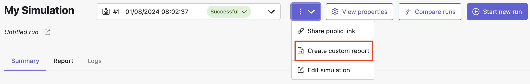
Create a custom report
The “Create custom report” option lets you create your own custom report. This custom report is visible online or in a PDF file that you can save and share.
All metrics and charts displayed in the Report tab are available for your custom report. You can also create reusable templates for your future needs.
Click the Create custom report button in the dropdown menu to access the configure and print PDF page.
This report is initialized with:
- a title element with the date of the run you were coming from
- the run status
- the run comments
- the run assertions
- the run requests summary
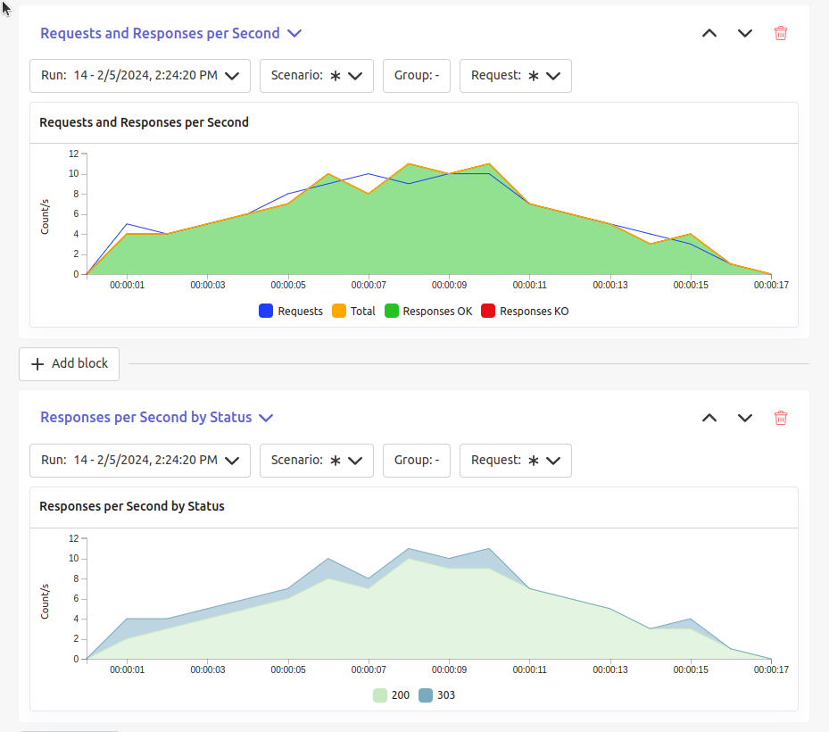
- 3 charts of the run:
- Requests and Responses per second
- Responses per Second by Status
- Response Time Percentiles
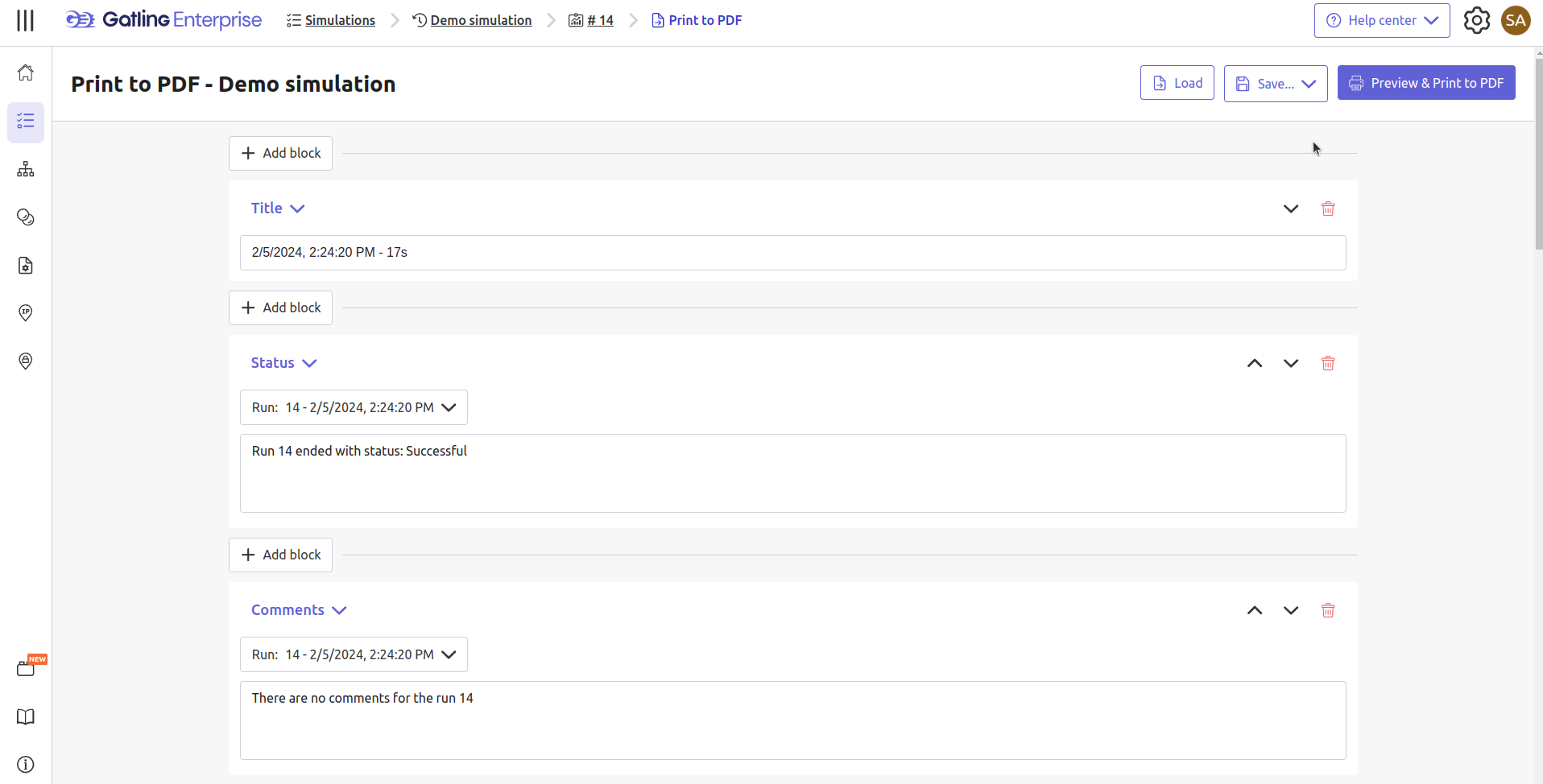
This page is a configurable list of different elements that are displayed in the report. You can click on the Add block button under every element to add another one.
Every element can be moved up or down by clicking on the arrows on the top right of the element, or be removed by clicking on the red trash icon.
Those elements are composed of:
- Title: adds a title element.
- Text Area: adds an editable text element.
- New Page: allows you to skip a page in the report.
- Run:
- Status: adds an editable text element with a predefined text set to the status of the selected run.
- Comments: adds an editable text element with a predefined text set to the comments of the selected run.
- Assertions: adds a table with the assertions of the selected run.
- Summary: adds the summary table of the selected run in a new landscape page.
- Chart: adds a chart element that you can interact with before exporting it to PDF.
- Counts: adds a count chart element that you can interact with before exporting it to PDF.
As the following images illustrate, every chart (or other element) can be interacted with individually. You can zoom in on sections, or select the run, the scenario, the group, etc.. whose data you want to fetch. You do not need to have the same settings for each element.
After adding all desired elements in the report you can click on the Preview & Print to PDF button on the top right or the page to get your PDF file.
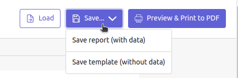
There are two more actions available to you:
- Save: saves the current Export configuration:
- as a template: this option saves the element list without the content
- as a save: this option saves everything, including the content of the Text Area and the configuration of the graphs
- Load: load a previously saved template or save.
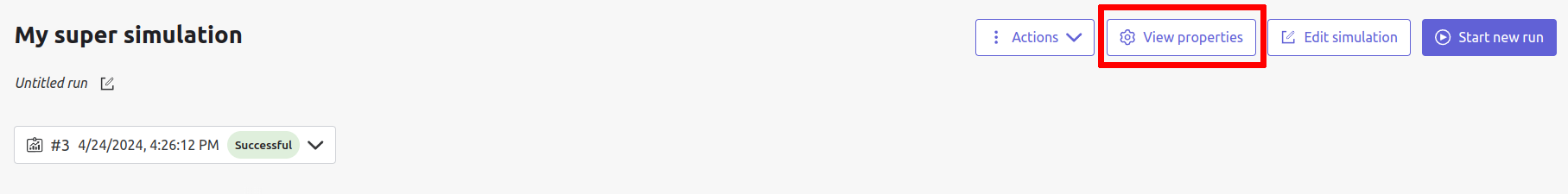
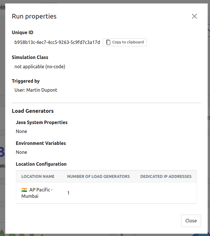
View properties
The View properties button, located in the top right action bar, shows every property you configured for your run.
Useful tips
Zoom
You can reset the zoom status by double-clicking on a chart. It is possible to change the time range window by doing any of the following actions:
- Clicking the zoom icons of the control buttons
- Selecting a zone in any charts or timelines
- Selecting a range of time from the top navigation bar
Markers
To ease your analysis, right-click on the charts to create markers. Click on the top of the marker to delete it.
Multiple highlights
In the top right menu, activate the Multiple Highlights setting which allows the tooltip to be displayed on every chart at the same time.
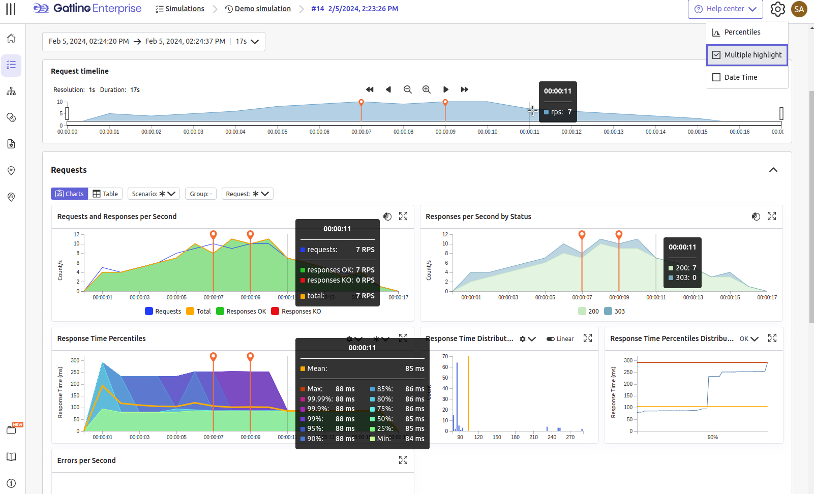
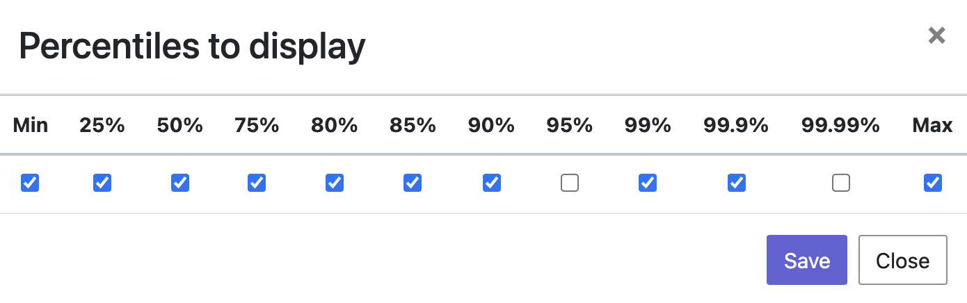
Percentiles mask
In the top right menu, click on the Percentiles setting to choose which percentiles to display in the chart.
Date time / elapsed time
In the top right menu, activate the Date Time setting which lets you switch from elapsed time to date time.
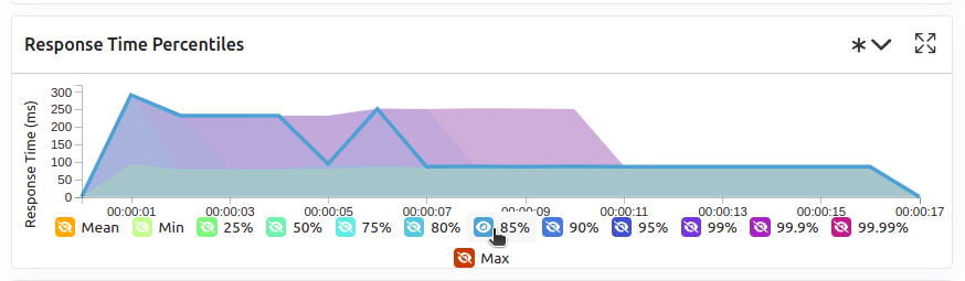
Highlight legend
If you hover your mouse over a label on the percentiles chart legend, you can highlight the curve on the chart, leading to a better view of that curve. The highlight legend option is enabled for every “non stacked” graph.
Run comparison
Gatling enterprise also offers the possibility to view and compare reports for each run.
You can either decide to export a PDF report and select for each chart which run it relates to, or you can compare the request response times and error rates using the compare function in the test details page.